The Stories Behind Our Favourite Album Covers
With the majority of us accessing music through streaming platforms, the days of excitedly unwrapping the plastic from CDs are somewhat behind us. Who else remembers pulling out the booklets to reveal pages of unseen images and lyrics ready to be learned off by heart? Although we may not hold onto music as tangible as we did before, many artists continue to place emphasis on creating meaningful artwork for albums, EPs and singles.
The ‘album cover’ TikTok trend was one of the many that took over our feeds this year. Users transformed random images into covers by simply adding the ‘parental advisory’ badge to a 4x4 image alongside the caption “proof that anything can be an album cover.” Although they’re not wrong - there is no rule as to what a cover should be, even if it is just a random blurry image taken at a house party - it doesn't mean there is a lack of artistic and meaningful art repping our favourite albums. Fortunately, therenaissance of Vinyl has helped to restore emphasis on the power of creative covers. The last time I sauntered into a record shop I was drawn to the aesthetics of unknown albums in the same way book covers attract us at bookstores. Comparing the TikTok trend of blurry images to thepoetic art neatly packaged before me, left me wondering what we class as an iconic album cover, so I dove into past and present musical artwork and the stories behind them.
Kendrick | To Pimp A Butterfly

This monochrome image of a group of Black men and boys celebrating outside of the White House is instantly recognisable. Holding stacks of cash and bottles as they pose over the body of a judge, gavel still in hand, eyes crossed out, it isn’t one you easily forget. Shot by Denis Rouvre, the image includes friends of Kendrick, some of whom he had grown up with since elementary school.
Speaking to Mass Appeal Lamar said “You look at these individuals and you look at them as bad people, or a menace to society, but they’re actually good people, just a product of their environment and the one person who always represents their life negatively is the judge. Only God can judge these individuals right there, not no one with a gavel.” He later explained that he wanted the image to represent those without money, that are rich in spirit. The album was released three years after the beginning of the Black Lives Matter movement and it held a mirror up to the internal and external conversations that Black people were having. The white judge represents the judicial system as a whole, that allows violent police to walk free while imprisoning those seeking justice, such as Ramsey Orta who was continuously harassed and eventually imprisoned.
In spite of it all, Black people still find joy within their own communities, and celebrate small wins. Black people can recognise the very richness Kendrick refers to flowing out of the individuals’ poses and smiles on the cover, and you can imagine their voices, chants, and shouts as they clamber on top of one another to pose. Some may feel negatively about the image, but it is familiar to anyone who has experienced the emotions of the people pictured.
The album features an amalgamation of several genres, but it is heavily jazz and blues influenced, playwright George C. Wolf once described blues as “the human spirit reaching beyond the externals of their conditions.” The cover chronicles this sentiment, with bottles and money filled and fat, it represents an act of commemorating life. Despite the obstacles people place in their way, whether it be microaggressions or biased judges deciding their future for them, they continue to be rich in spirit, marking their joy even in locations where they are traditionally not accepted - such as the white house. Here is an image of a group of friends posing on a hot summer's day believing that despite it all, “we gon’ be alright.”
The Roots | Things Fall Apart
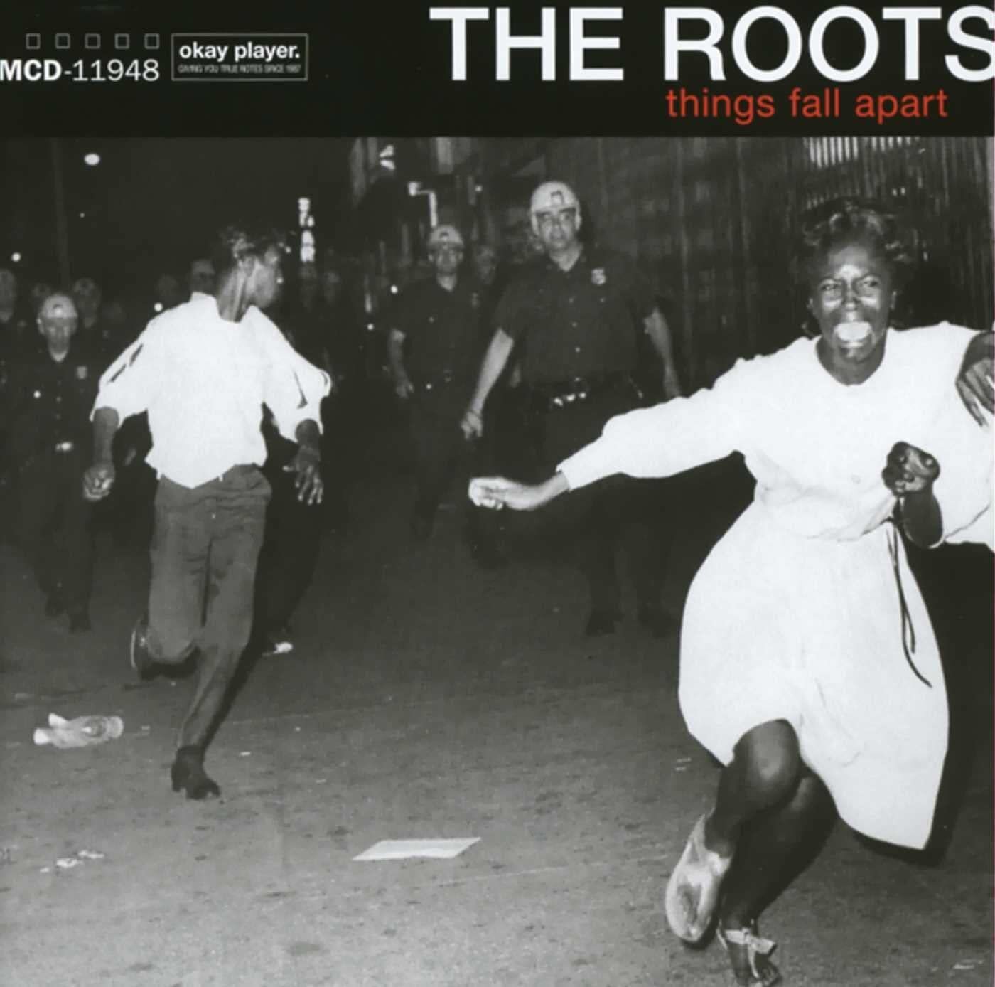
In 1999, hip hop band The Roots released their fourth album Things Fall Apart, which is now considered their breakthrough masterpiece. The title is inspired by a Novel of the same name by Chinua Achebe, whose name derives from poem ‘The Second Coming’ by Yeats.
The cover of Things Fall Apart shows a photograph of two Black women running from the police in Bedford-Stuyvesant, Brooklyn during a riot in the 1960s. The riot was potentially linked to the Night Of Birmingham Horror, where rioting occurred following the murder of 15-year-old James Powell by a police officer. The well-known image is one of five chosen for limited edition covers under the theme of “visual failure in society”, showing civilization in its most somber moments. The art director, Kenny Gravillis, described the cover as “unflinching and aggressive in its commentary on society.”
The Roots never shied away from creating conscious music addressing the failings of humans and our self-induced pain, and neither did their cover. “Y'all clueless to what the f*ck is up again / Yo, hard times and sufferin' / What? My peoples in the crevices strugglin' /'Nuff of them a toy soldier thespian”, despite the hip hop world about to hit a commercial renaissance in the 2000s, The Roots album stands as evidence for a hip-hop group who flows true in the conscious rap realm, using impactful art whether visually or lyrically to address societal affairs.
Marvin Gaye | I Want You

Works of the late Ernie Barnes are often seen hanging in the houses of our aunts, uncles and grandparents. Athlete turned painter, Barnes created what he knew, whether it was a sporting event or Black people just existing, doing mundane activities like grocery shopping. His art transforms these regular routines into the most extraordinary acts by the way he stretches out their movements, highlights the way the light rests upon their brown skin and places the colour found within their imaginary personalities onto the paper for us to interact with.
Curator Bridget R Cooks told The Guardian that the inspiration for the painting came when a young Barrnes peeked through the window of a venue called the Armory, hosting an R&B fueled party, “he was captivated by the style of dance and never saw that before.” The idea of a young child sneaking a glimpse of grown folk dancing in the way grown folk do, makes this image feel even more familiar. Think of being a child, bewildered by the way adults are moving slowly and closely together at heavy-bass parties, as a small child, the adults would look as gigantic and peculiar as the ones in Barnes’ image. But when I gaze upon this image now, the freedom and recognition found within his artwork makes me feel in awe of the beauty of our own movements and surroundings as Black people.
The Sugar Shack, as featured on Marvin Gaye’s album I Want You, featureselongated characters with bodies curved into one another, eyes tightly shut as they find themselves lost in the music. Staring at the art you can almost feel the heat radiating out of the room, and if you look long enough you might even think you saw a character move. Ernie Barnes’ expressive artwork captured the magic of living while Black, and if there were to be any soundtrack to this lust filled image, it would without a doubt be the namesake track I want you.
Alicaì Harley | Yard Gyal Inna Britain

When Alicaì Harley released the artwork for her debut EP, 90s babies revealed themselves as they took to social media to praise the nostalgic image. The cover was inspired by Mary Hoffman's children's book Amazing Grace, which tells the story of a young girl whose childlike aspirations were continuously shot down because she is a Black girl. Eventually her mother and grandmother encourage her, and she goes on to successfully live out her aspirations.
Originally from Jamaica, Alicaì told Buzzfeed that as she struggled to settle into the UK, reading Amazing Grace in year 2 helped her with her confidence throughout the years, saying “the book stuck with me. I wanted this EP to represent where I'm coming from and where I'm at, not just vibes but the reality of me, so yeah. The EP Yard Gyal Inna Britain fits perfectly with the inspiration behind the image.”
The sentimental reference was for many young Black girls a refreshing reflection to find within their classrooms, so seeing the cover made the jovial nature of the album feel even more so like a celebration of how one Black women’s confidence of being a yard gyal inna Britain came full circle.
As a young Black girl I was convinced Grace had my exact face, so much so that it scared me. I would just stare at the book, waiting for her to wink back. So, upon seeing the cover with Alicaì’s face replacing that of Grace’s I chuckled warmly to myself realising that so many of us had felt the same. Much like the EP, which includes fresh dancehall vibes alongside a hit 2000s sample (Ashanti fans where you at?) the artwork made me feel excited, somewhat nostalgic, and hopeful.
Rihanna | Anti

Moody and gritty, Rihanna’s 2016 album Anti stepped away from her pop heavy tunes accompanied with self-portrait cover images, and into an album that felt thoughtful and raw, reflected in the artwork for her eighth studio album. The cover art, which is a part of Roy Nachum’s ‘Blind’ series, is of a young Rihanna wearing a golden crown blocking her vision. The image is partly covered in dripping red paint, and entirely covered in Braille. Nachum’s work often features a child whose eyes are covered by a gold crown “suggesting man’s blindness caused by displaced values and desire.” In relation to the balloon held within her hand, he said that it “embodies the possibility of escape and signifies the human need to transcend physical reality.”
Rihanna collaborated with poet Chloe Mitchell to write the braille poem, which floats amongst themes of being misunderstood, and coming to comfort with this reality by using it in a way that benefits them. The album also wraps itself around the same sentiment; the otherwise elusive Rihanna stretches herself emotionally throughout each track, looking back at her experiences from the young girl we first met in 2003 into the woman who is navigating her own values and desires, lifting the crown from her eyes to her head.
To some the braille poem may seem like a hidden message, despite it clearly being accessible both visually and physically. I’d like to think that it signifies that the option to communicate in more inventive ways is right in front of us. To advance our growth, much like the album has done, we often have to challenge who we surround ourselves with or who we talk to which also includes advancing how we communicate. Although braille may not be everyone's answer, it is one of the many beautiful ways we can connect with people and share messages despite barriers, especially in art - it transcends spoken languages. The portrait continues to the back of the album which shows the back of the child, hinting that the contents of the album encompass the the spirit and development of Robyn turned Rihanna, and how her methods of communicating have developed with her.
Little Simz | Stillness In Wonderland

Stillness In Wonderland is an obvious yet intriguing nod to the children’s fantasy book Alice In Wonderland. In an interview with VICE, Little Simz had said the title is “about situations I’m still trying to get my head around, and places where I’m still trying to figure out who to trust, or who not to trust.”
The album cover seems to suggest that her Wonderland is her home, London. The visual shows an evolving fantasy world birthed from her own imagination. She remains still, observing and embracing her pleasant reverie. So, when she says Stillness in Wonderland, it leaves us wondering whether stillness isn’t something she has but rather desires.
Surrealism in art and literature has often been used as a way to investigate the complexities of the human mind, a theme explored in the coming-of-age tale Alice In Wonderland, making it a perfect fit for Simz’ sophomore album. She looks at the realities of growing up as a Black woman throughout.The toll of experiencing and combating racism is referenced within the opening track featuring Chronixx “Still I fight fire with fire, streets still hot like fire. What's the matter with matter? Still marching, screaming black lives matter.” Could it be that her glazed over eyes are a mixture of the exhaustion of such ongoing struggles and that of her being mentally exhausted as track “No More Wonderland” suggests. Despite the beauty of her own creation, she feels the weight of the real world calling her back. She would rather leave Wonderland than be stuck in the figment of her own imagination. This sentiment feels like testament to the Black women experience, as previous track Low Tide says “We love harder in the struggle” - it’s not necessarily a happy reality, but perhaps that’s why Little Simz takes us to her Wonderland only to meet us back in the real world again.
Bree Runway | Be Runway

Be Runway, Bree Runway's third EP shows an image of what appears to be a partly bleached Bree wearing a blue contact lens in her right eye. Bree had previously spoken about being bullied for her dark skin and her attempt to bleach it, resulting in chemical burns. The first track of EP is 2ON which Bree tweeted out saying “Every day we are told that we could be better, prettier, brighter – as if there’s something wrong with us in the first place?” As reported by The Conversation, racialised women spent more than $8.6 billion on skin bleaching creams in 2020, noting the direct correlation between socioeconomic status and career opportunity, attractiveness, marriageability and skin color, “the idealization of light skin as the pinnacle of beauty affects self-esteem for women of color around the world.”
The following track Big Racks’ includes a music video looking at racial discrimination in the workplace. Although the music featured feels preppy, much like the cover the message behind it is more haunting than it first seems. On the topic of her cover, Bree said to Dazed “my Be Runway EP (2019) cover is half white, half black and that in itself is a message. I want you to be free and be yourself. The darker side of it [represents] the lengths people will go to become lighter and also to become more acceptable socially and in our workplaces. For the EP, I looked at the lengths we would go to damage ourselves because of society.”
The image is her interpretation of a physical and mental struggle she had with her skin, playing with the idea of putting up with appearances and smiling through the pain, even when things are visually very abnormal. The desire to look more attractive in western terms has often come at the expense of people's health, mentally and physically. The cover is unsettling in the same way that socially focused horror films, such as US (2019) makes you feel. It’s entertaining but the relatability is unnerving. It can’t be denied that the work on this cover is stunning, a wonderful blend of meaning and appealing aesthetics for a pop princess who doesn't flinch from exploring both together and separately.
After scrolling through different covers, both online and in-person, and discussing who really judges what makes art revered with friends, I’m happy to conclude that, yes cover art can be iconic simply because it is visually stunning or shocking, but it goes beyond just a memorable image. The stories behind how they came into existence alongside our own unique interpretations, separate from what the original artist tells us, is what creates iconic artwork. Like every artist, musicians have created their albums and accompanying covers as a result of their own experiences and research, but eventually they hand the work over to us. We can then stir it into our own artwork, use it as the soundtrack to our own experiences, or hang it as art on our own walls. Developing personal emotive interpretations of what it means to be iconic.